
The Cheese Store of Beverly Hills
Bringing the charm of the cheese counter to your screen.
Role
Lead UX/UI Designer
Tool
Figma
Project Duration
Context
1 Month
Gourmet foods and artisanal cheeses have traditionally been bought in-store. But the gourmet experience has been rapidly evolving in recent years, influenced by the shift from offline to online shopping.
One of the exceptional gourmet food stores is The Cheese Store of Beverly Hills, a Los Angeles staple since 1967.
As a loyal customer myself, I took the initiative to redesign the site with one guiding question: How can I bring the warmth and delight of the in-store experience to the online journey?
Responsibilities
User Research, Paper and Digital Wireframing, Low and High-Fidelity Prototyping, Usability Studies
Project Overview
Goal
It was essential to address user pain points, particularly the difficulty of finding specific products or services.
The main goal became clear: to simplify the browsing process and encourage more users to complete their orders online.
Solution
I redesigned the website for The Cheese Store of Beverly Hills to better support the online sale and promotion of gourmet foods and cheeses for pickup and delivery.
The new design simplifies navigation with an intuitive interface, making it easy for both individual enthusiasts and catering users to place online orders and discover the products they love.
Problem Statement
The client’s website has a confusing navigation, with inconsistent information architecture and too many steps, making it hard for users to find products and complete purchases.
Design Process
I followed a standard design process, beginning with user research. Through conducting in-person user interviews and online qualitative research, I discovered key insights and identified common pain points in the current user experience.
With these findings, I moved into ideation, starting with paper sketches and refining concepts through multiple iterations to arrive at a high-fidelity prototype for the website redesign.
I then presented the design to the client, gathered feedback, and conducted usability testing. Based on the results, I made further refinements to ensure a smoother, more user-friendly experience.

1. Learning About the User
User Research
User Groups
The Cheese Store is a beloved Los Angeles gem with a strong nationwide reputation for satisfying gourmet enthusiasts.
To thoroughly understand the target consumer groups, I conducted in-person user interviews, as well as an in-depth analysis of online reviews from food lovers drawn to the store’s high-quality selection of artisanal cheeses, wines, specialty foods, and catering services.
After analyzing the results from user research, I found that the main consumer base consists of:
Online customers – This group includes both those who have visited the store and those who haven’t. They typically shop for specific products of interest or subscribe to monthly cheese selection deliveries.
Local customers – Those who order individual items, catering pickups, or local deliveries.
To comprehensively understand the average user experience, I conducted a competitive analysis on the websites of three major California-based businesses specializing in gourmet foods/cheeses: Say Cheese, Andrew’s Cheese Shop and La Fromagerie.
Questions that guided the analysis:
How do users typically discover new gourmet foods/cheeses to buy online?
What information do users look for before purchasing gourmet foods/cheeses?
What factors influence users to purchase gourmet foods/cheeses online instead of in-store?
Do users prefer a guided shopping experience or to freely browse?
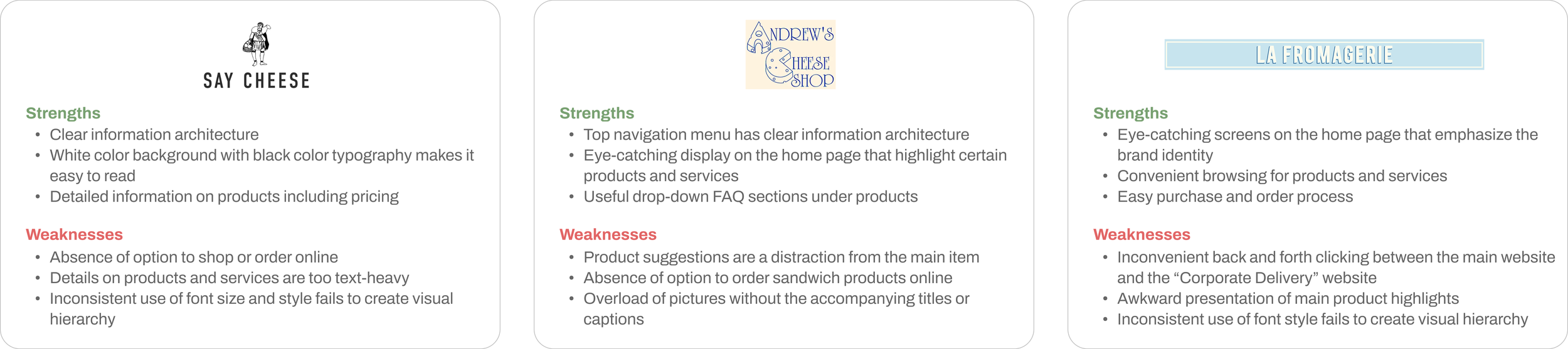
Discoveries from the analysis:
Shipping options matter: Organizing product categories based on delivery or pickup availability makes shopping more convenient. (La Fromagerie)
Visual hierarchy should be clear: Highlighting certain products or services helps users easily differentiate content. (La Fromagerie, Andrew’s Cheese Shop)
Content presentation should be balanced: A mix of text details and images with captions enhances the online shopping experience. (Say Cheese, Andrew’s Cheese Shop)
Limited online ordering hinders user journey: Some businesses do not offer online ordering for certain products. (Say Cheese, Andrew’s Cheese Shop)
Competitive Analysis
Lessons
2. Tackling the Challenges
Pain Points
I identified that the following challenges need to be addressed with The Cheese Store’s website:
Confusing information architecture, particularly the navigation menu, with unorganized menus and inconsistent category labels
Unclear shipping options for different product/service categories
Too many steps for basic actions like browsing and ordering
Proposed Solutions
Re-stacking Categories
To solve the identified issues, I brainstormed the following solutions:
Recategorize navigation menu items according to consistency among content
Present local pickup and delivery products as menus and provide a separate button that would start the ordering process
Separate and highlight “Cheese of the Month” so that it would gain more recognition as a special feature
The website’s layout was confusing because products with different shipping options—like local pickup, local delivery, and nationwide shipping—were scattered across various tabs and often overlapped.
To fix this, I started by creating a table to categorize the products based on their shipping options. This helped clarify which products belonged where.

3. Building the Framework
Paper Sketches
Low-fidelity Wireframes
Based on the analysis above, I created rough paper sketches of the home page to explore possible solutions and improvements. Then, I selected one design and refined it into paper wireframes, highlighting key website enhancements.
Here are some of the initial sketches for the home page, menu page, Cheese of the Month page, and about page.

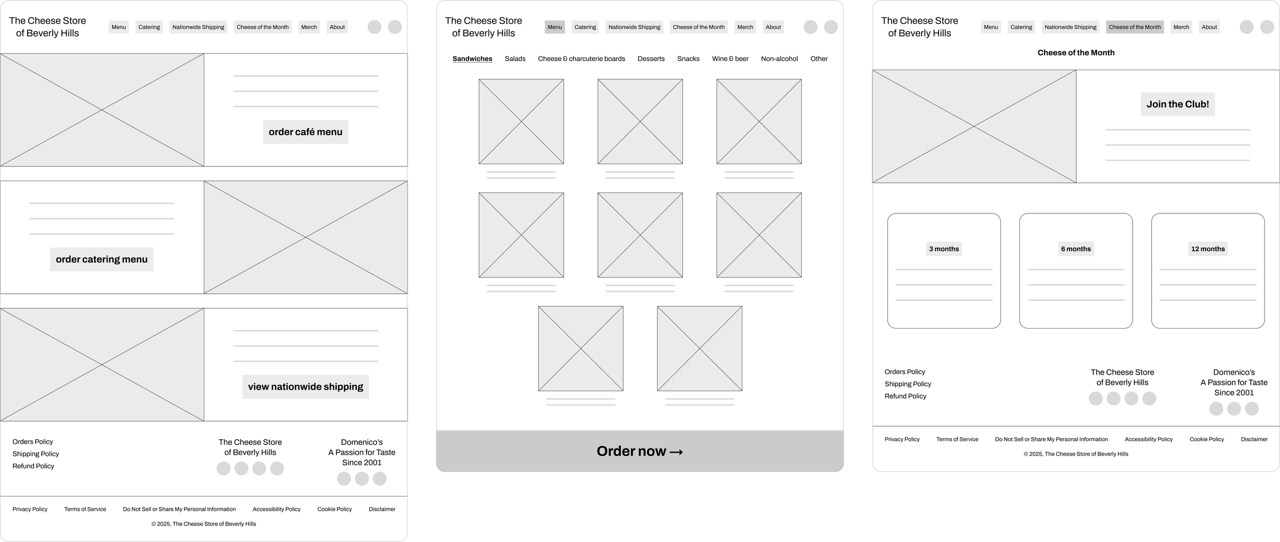
Next, I drafted low-fidelity digital wireframes to gather feedback on the layout and structure of the design. My main goal was to build a well-organized information structure across all pages. I also wanted to make it easy for users to navigate and find the products they were interested in.
To achieve this, I focused on a clear visual hierarchy and a consistent layout for the prototype.
Usability Study
I conducted user testing at each key stage of the project to uncover major pain points in the current version.
After gathering feedback, I refined the prototypes and continued testing to validate improvements. Specifically, I realized that the top navigation menu could be even more simplified according to online shopping, café menu ordering and catering menu ordering.
Further, it was more consistent to group the “Cheese of the Month” page under the general category of online shopping.
4. Bringing the Design to Life
#1: xxx
xxx
#2: xxx
xxx
#3: xxx
xxx
#4: xxx
xxx
Design Decisions
Visual System
I adopted a minimal yet sophisticated design approach to create a modern, premium, and elegant visual identity for the client's website.
xxx
5. The Takeaway
Usability Study
Final Insight
xxx
xxx
The Next Chapter
Wrapping up my second UX design project, I’m walking away with sharper skills, deeper insight, and a clear vision for what’s next. I’m ready to take on new challenges that will make an impact.
On to the next. Stay tuned.
I’m excited to bring the same dedication to crafting a website that tells your story - one that feels true to your brand and values.