Grizzly Campers
Did a camping trip ever make it out of your group chat?
If not, you’re not alone.
Role
Lead UX/UI Designer
Tool
Figma
Project Duration
Context
5 Months
We’re all the same when it comes down to procrastinating at the thought of planning the nitty-gritty details. But after all, camping is supposed to be a chance to unplug, a chance to escape from reality, isn’t it?
That’s what inspired me to start building a mobile app for a camping supply store to advertise and sell its products, a space where shopping for camping will be a stress-free journey.
I worked as a solo Designer to design and prototype a conceptual mobile app for a camping supply company. I built wireframes, established the design system, and conducted multiple rounds of iterations.
Responsibilities
User Research, Paper and Digital Wireframing, Low and High-Fidelity Prototyping, Usability Studies
Project Overview
Goals
Design an application that
Provides comparison of the same type of products
Guides users on the camping essentials
Allows users to explore a wide range of camping products
Solution
I designed a mobile app for selling and advertising camping equipment, making it easy for both experienced campers and beginners to find and purchase the gear they need. This mobile app streamlines the search process with an intuitive interface, ensuring that users can quickly access essential camping gear.
Problem Statement
Users lack the time and information to explore, review, and purchase camping gear.
Design Process
I applied the standard design process by starting with user research.
After analyzing key insights from secondary research and user interviews, I identified the most common pain points and moved into the ideation phase. Through a series of iterations which started with paper sketches to high-fidelity prototypes, I developed the mobile app design.
Finally, to wrap up, I conducted a concluding round of usability tests and refined the design further based on the user feedback.
1. Understanding the User
Qualitative Research
Types of Users
So why is camping such an appealing yet seemingly difficult activity?
I gathered information on what campers look for in camping equipment by exploring discussions on major forums such as The RV Forum, Camper Community, and Reddit. By analyzing conversations and reviews on these platforms, I was able to pinpoint the key features and priorities that matter most to the camping community.
Upon my analysis, I identified the two types of target users:
First-time campers who are unsure what to pack for a day in the wilderness, and the idea of “escape” into nature becomes a hassle.
Then, there are second-time or professional campers who really want to get down to business and see detailed comparisons to make a well-informed decision, which it is often time-consuming and difficult.
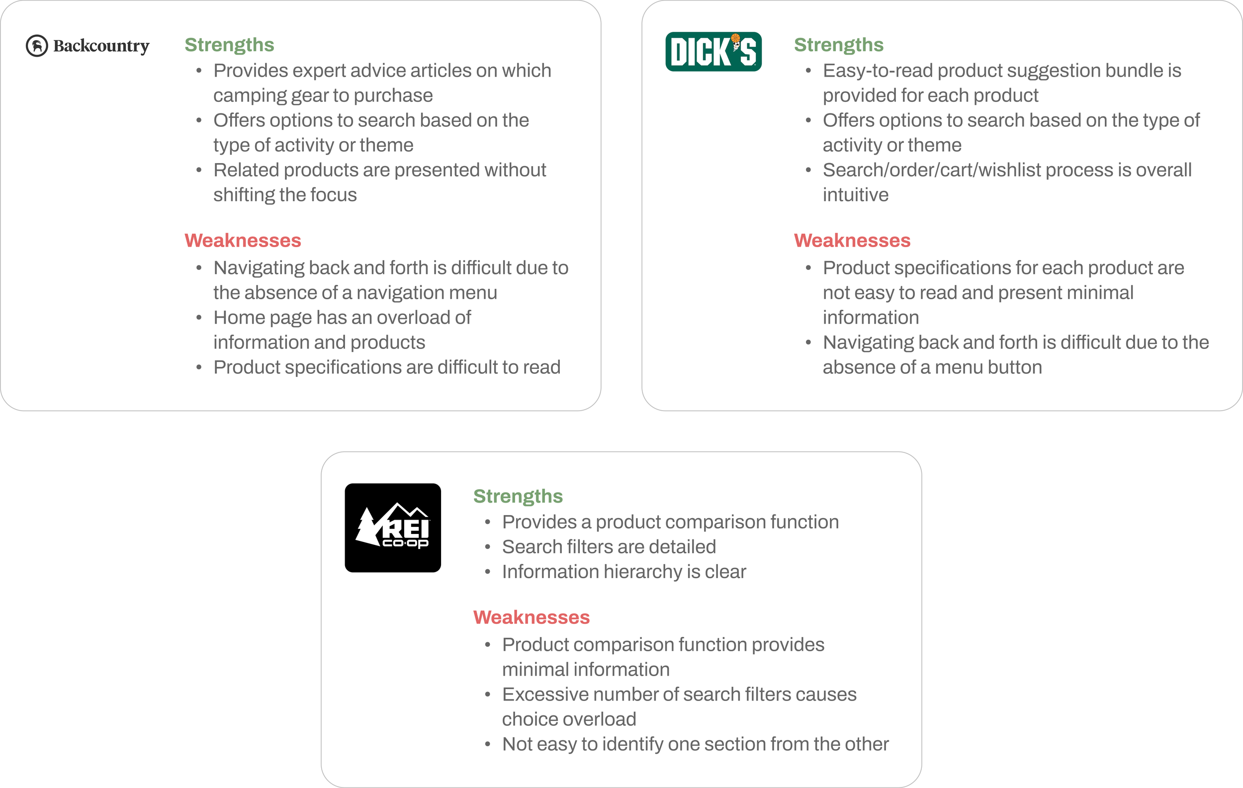
To comprehensively understand the average user experience, I conducted a competitive analysis on the mobile apps of the following major retail and outdoor recreation companies: Backcountry, Dick’s and REI.
I was able to identify potential areas for improvement by focusing on the following aspects:
How easy is it for users to find their products of interest?
Is it possible to compare the features of products?
How are product specifications presented to users?
How are product recommendations offered to users?
I found that the competitors offered helpful features such as
a product comparison function (Rei)
related product buying guides (Dick’s and Backcountry)
detailed search filter options (Rei, Dick’s and Backcountry)
However, they revealed loopholes in
providing too many search options that could cause users to feel frustrated by choice overload (Rei)
lacking in providing a comprehensive list of product specifications (Rei, Dick’s and Backcountry)
missing convenient navigation menus for users to quickly go back and forth between pages (Dick’s and Backcountry)
Competitive Analysis
Lessons
2. Analyzing the Challenges
Project Objective
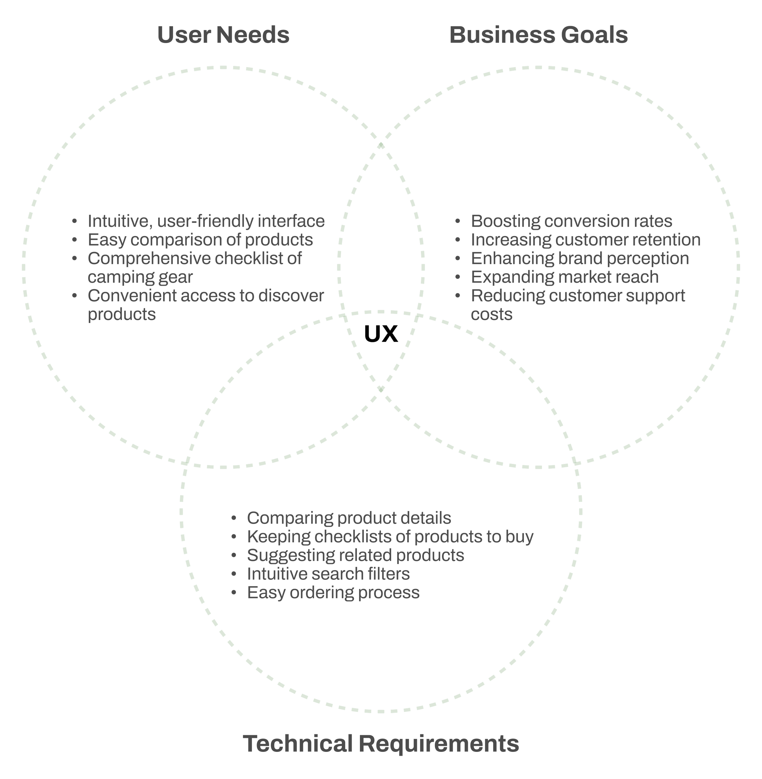
I imagined myself in the shoes of: a user anticipating an upcoming camping trip, the CEO of the client company stuck with a budget strain, and the app development team tasked with perfecting the user journey.
I used this mix of perspectives as a compass during the entirety of my design thinking process, so as to maintain focus on the priorities of this project.
Pain Points
I identified the following challenges that should be tackled:
Too time-consuming to compare the specifications of each product
Unsure how to check the complete list of items necessary for a camping trip
Overload of products irrespective of themes, camping sites, and capacity
Proposed Solutions
To address the identified issues, I developed potential solutions, including:
Implementing a search filter tailored to highlight features most relevant to the user
Introducing a camping advice section to ensure users have a complete checklist of necessary equipment
Creating an easy-to-read specifications page for each product
Suggesting related products to assist users in their selection process
3. Doing the Groundwork
Low-fidelity Wireframes
As the first step in problem-solving, I took a seat to begin paper sketching to head right into brainstorming. This method allowed me to explore various concepts in a short timeframe, helping me visualize the product’s potential appearance and functionality before moving onto digital wireframes.
I then quickly built basic wireframes to collect feedback on the proposed design's layout and structure. My primary focus was on developing a well-structured design for the search filter page, product page, and navigation elements across all pages. This process involved establishing a clear visual hierarchy and a consistent layout for the prototype.
Usability Study
To understand how users engaged with the initial design, I conducted a usability test with five participants. I managed the user recruitment process, ensuring diversity by selecting users from various states across the U.S. to accurately represent the target audience.
I asked questions such as:
What key factors influence your decision when purchasing a product?
What challenges do you frequently encounter during the purchasing process?
After gathering my findings, I focused on synthesizing and prioritizing key insights to make informed design decisions. I used affinity mapping to clearly identify users' pain points, needs, and preferences.
Lessons
Users wished for:
Intuitive search process
Navigation menus that can be readily accessed on any page
Icons to be easily clickable and findable
Users were satisfied with:
Detailed search filter function
Easy order and purchase process
Upon carefully considering the usability test results, I realized that simply improving search filters and the product specification page was not enough to address more inherent user challenges, such as comparing products side by side and keeping track of items to purchase.
To better meet user needs, I decided to build innovative features not commonly found in shopping apps. Through multiple iterations, I designed and refined features that enable easy product comparisons and allow the app to function as a personalized shopping list.
4. Prototyping the Design
#1: Twist on the Classic Compare & Contrast Table
Campers often need gear that meets specific requirements, such as being ultralight or water-resistant, meeting the ideal size and weight, and so on.
To make product selection easier, I introduced a feature called "Comparo." Now, each product in the search results includes an "Add to Comparo" button, allowing users to save items for comparison. On the “Comparo” page, products are automatically organized by category, making it easy to add and compare similar items. Users can then request a comparison view and scroll to review product details side by side.
#4: Staying in Trend
In today's digital age, social media plays a key role in people's lives, making it valuable for retail brands to engage with users in an enjoyable way.
To foster a sense of community and inspire shopping, I introduced a "Get Inspired" feature in the mobile app. This allows users to explore products shared on social media and conveniently purchase them by clicking the "shop now" button, which will land the user on the product details of the product of interest.
#2: Pack Like a Professional
One of the biggest challenges of camping is keeping track of all the necessary gear, from sleeping bags to cooking utensils.
To simplify this process, I introduced a feature called "ProPack." This feature allows users to create customizable or template-based checklists, marking items no longer needed with a green checkmark and leaving unchecked circles for items they still need. A green shopping bag icon appears next to unchecked items, which users can click to start searching for products. Users can also update their lists, adjust quantities, and keep track of gear not yet purchased.
To make it easy to go back and forth between ProPack’s checklists, cart, and favorites, I consolidated all three features under the main tab of “ProPack.”
#3: Information is Power
Every camping trip comes with its own challenges, making it essential to understand the environment beforehand - Will temperatures drop below freezing? Is it safe for children to camp?
To help campers make informed decisions, I introduced a "Buying Guide" section. This feature offers curated lists of essential camping gear along with expert advice on selecting the right products. When users open an article, they can explore a comprehensive list of recommended items, browse products by category, add items to their “ProPack” checklists, or read in-depth expert guidance.
Design Decisions
Style Guide
I developed a style guide to establish the brand identity. Given the text-heavy nature of camping gear product specifications, I focused on colors and typography to enhance readability to make it easy to read texts while highlighting certain content.
Namely, I selected green (#78A171) as the primary color because it embodies vitality of the outdoors, creating an atmosphere that aligns with the adventurous spirit of camping.
5. The Final Verdict
Usability Study
Final Thoughts
The final round of usability test of the high-fidelity mockup revealed a high level of user satisfaction. Optimized navigation and strategic content placement not only enhanced the overall user experience but also encouraged users to develop interest in exploring various products.
I had a total of four users complete the System Usability Scale (“SUS”) survey, and the high-fidelity mockup showed an excellent score in SUS of 88.1 pts.
Grizzly Campers was an exciting and challenging project. I started with a determination to build a camping gear mobile app for camping professionals as well as amateurs, and worked to bring it to life.
I encountered challenges, such as making text-heavy product details easy to read and access, as well as providing product suggestions without disrupting the main user journey. However, by keeping up an innovative and user-friendly mindset, I successfully made design decisions that satisfied both the user and the hypothetical client.
In a real-world scenario, I am confident this approach would have effectively addressed areas of user confusion, leading to a significant increase in user traffic in the targeted product categories, leading to notable growth in revenue, additional business opportunities, and a stronger online presence for the client.
What’s Next?
As I wrap up my very first UX design project, I can’t wait to embark on another challenge where I can apply the valuable lessons of empathy and iteration!
Stay tuned as I hike onto my next project!
I’d love to create a mobile app that genuinely captures your narrative and core values.


